Class Slider
- All Implemented Interfaces:
Styleable,EventTarget,Skinnable
The three fundamental variables of the slider are min,
max, and value. The value should always
be a number within the range defined by min and
max. min should always be less than or equal to
max (although a slider whose min and
max are equal is a degenerate case that makes no sense).
min defaults to 0, whereas max defaults to 100.
This first example creates a slider whose range, or span, goes from 0 to 1, and whose value defaults to .5:
Slider slider = new Slider(0, 1, 0.5);
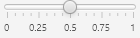
This next example shows a slider with customized tick marks and tick mark labels, which also spans from 0 to 1:
 Slider slider = new Slider(0, 1, 0.5);
 slider.setShowTickMarks(true);
 slider.setShowTickLabels(true);
 slider.setMajorTickUnit(0.25f);
 slider.setBlockIncrement(0.1f);
- Since:
- JavaFX 2.0
-
Property Summary
PropertiesTypePropertyDescriptionfinal DoublePropertyThe amount by which to adjust the slider if the track of the slider is clicked.final ObjectProperty<StringConverter<Double>> A function for formatting the label for a major tick.final DoublePropertyThe unit distance between major tick marks.final DoublePropertyThe maximum value represented by this Slider.final IntegerPropertyThe number of minor ticks to place between any two major ticks.final DoublePropertyThe minimum value represented by this Slider.final ObjectProperty<Orientation> The orientation of theSlidercan either be horizontal or vertical.final BooleanPropertyIndicates that the labels for tick marks should be shown.final BooleanPropertySpecifies whether theSkinimplementation should show tick marks.final BooleanPropertyIndicates whether thevalueof theSlidershould always be aligned with the tick marks.final BooleanPropertyWhen true, indicates the current value of this Slider is changing.final DoublePropertyThe current value represented by this Slider.Properties declared in class javafx.scene.control.Control
contextMenu, skin, tooltipProperties declared in class javafx.scene.layout.Region
background, border, cacheShape, centerShape, height, insets, maxHeight, maxWidth, minHeight, minWidth, opaqueInsets, padding, prefHeight, prefWidth, scaleShape, shape, snapToPixel, widthProperties declared in class javafx.scene.Parent
needsLayoutProperties declared in class javafx.scene.Node
accessibleHelp, accessibleRoleDescription, accessibleRole, accessibleText, blendMode, boundsInLocal, boundsInParent, cacheHint, cache, clip, cursor, depthTest, disabled, disable, effectiveNodeOrientation, effect, eventDispatcher, focused, focusTraversable, focusVisible, focusWithin, hover, id, inputMethodRequests, layoutBounds, layoutX, layoutY, localToParentTransform, localToSceneTransform, managed, mouseTransparent, nodeOrientation, onContextMenuRequested, onDragDetected, onDragDone, onDragDropped, onDragEntered, onDragExited, onDragOver, onInputMethodTextChanged, onKeyPressed, onKeyReleased, onKeyTyped, onMouseClicked, onMouseDragEntered, onMouseDragExited, onMouseDragged, onMouseDragOver, onMouseDragReleased, onMouseEntered, onMouseExited, onMouseMoved, onMousePressed, onMouseReleased, onRotate, onRotationFinished, onRotationStarted, onScrollFinished, onScroll, onScrollStarted, onSwipeDown, onSwipeLeft, onSwipeRight, onSwipeUp, onTouchMoved, onTouchPressed, onTouchReleased, onTouchStationary, onZoomFinished, onZoom, onZoomStarted, opacity, parent, pickOnBounds, pressed, rotate, rotationAxis, scaleX, scaleY, scaleZ, scene, style, translateX, translateY, translateZ, viewOrder, visible -
Field Summary
Fields declared in class javafx.scene.layout.Region
USE_COMPUTED_SIZE, USE_PREF_SIZEFields declared in class javafx.scene.Node
BASELINE_OFFSET_SAME_AS_HEIGHT -
Constructor Summary
Constructors -
Method Summary
Modifier and TypeMethodDescriptionvoidadjustValue(double newValue) Adjustsvalueto matchnewValue.final DoublePropertyThe amount by which to adjust the slider if the track of the slider is clicked.voidDecrements the value byblockIncrement, bounded by max.final doubleGets the value of theblockIncrementproperty.static List<CssMetaData<? extends Styleable, ?>> Gets theCssMetaDataassociated with this class, which may include theCssMetaDataof its superclasses.protected List<CssMetaData<? extends Styleable, ?>> Gets the unmodifiable list of the control's CSS-styleable properties.final StringConverter<Double> Gets the value of thelabelFormatterproperty.final doubleGets the value of themajorTickUnitproperty.final doublegetMax()Gets the value of themaxproperty.final doublegetMin()Gets the value of theminproperty.final intGets the value of theminorTickCountproperty.final OrientationGets the value of theorientationproperty.final doublegetValue()Gets the value of thevalueproperty.voidIncrements the value byblockIncrement, bounded by max.final booleanGets the value of theshowTickLabelsproperty.final booleanGets the value of theshowTickMarksproperty.final booleanGets the value of thesnapToTicksproperty.final booleanGets the value of thevalueChangingproperty.final ObjectProperty<StringConverter<Double>> A function for formatting the label for a major tick.final DoublePropertyThe unit distance between major tick marks.final DoublePropertyThe maximum value represented by this Slider.final IntegerPropertyThe number of minor ticks to place between any two major ticks.final DoublePropertyThe minimum value represented by this Slider.final ObjectProperty<Orientation> The orientation of theSlidercan either be horizontal or vertical.final voidsetBlockIncrement(double value) Sets the value of theblockIncrementproperty.final voidsetLabelFormatter(StringConverter<Double> value) Sets the value of thelabelFormatterproperty.final voidsetMajorTickUnit(double value) Sets the value of themajorTickUnitproperty.final voidsetMax(double value) Sets the value of themaxproperty.final voidsetMin(double value) Sets the value of theminproperty.final voidsetMinorTickCount(int value) Sets the value of theminorTickCountproperty.final voidsetOrientation(Orientation value) Sets the value of theorientationproperty.final voidsetShowTickLabels(boolean value) Sets the value of theshowTickLabelsproperty.final voidsetShowTickMarks(boolean value) Sets the value of theshowTickMarksproperty.final voidsetSnapToTicks(boolean value) Sets the value of thesnapToTicksproperty.final voidsetValue(double value) Sets the value of thevalueproperty.final voidsetValueChanging(boolean value) Sets the value of thevalueChangingproperty.final BooleanPropertyIndicates that the labels for tick marks should be shown.final BooleanPropertySpecifies whether theSkinimplementation should show tick marks.final BooleanPropertyIndicates whether thevalueof theSlidershould always be aligned with the tick marks.final BooleanPropertyWhen true, indicates the current value of this Slider is changing.final DoublePropertyThe current value represented by this Slider.Methods declared in class javafx.scene.control.Control
computeMaxHeight, computeMaxWidth, computeMinHeight, computeMinWidth, contextMenuProperty, createDefaultSkin, getContextMenu, getCssMetaData, getInitialFocusTraversable, getSkin, getTooltip, isResizable, setContextMenu, setSkin, setTooltip, skinProperty, tooltipPropertyMethods declared in class javafx.scene.layout.Region
backgroundProperty, borderProperty, cacheShapeProperty, centerShapeProperty, computePrefHeight, computePrefWidth, getBackground, getBorder, getHeight, getInsets, getMaxHeight, getMaxWidth, getMinHeight, getMinWidth, getOpaqueInsets, getPadding, getPrefHeight, getPrefWidth, getShape, getUserAgentStylesheet, getWidth, heightProperty, insetsProperty, isCacheShape, isCenterShape, isScaleShape, isSnapToPixel, layoutInArea, layoutInArea, layoutInArea, layoutInArea, maxHeight, maxHeightProperty, maxWidth, maxWidthProperty, minHeight, minHeightProperty, minWidth, minWidthProperty, opaqueInsetsProperty, paddingProperty, positionInArea, positionInArea, prefHeight, prefHeightProperty, prefWidth, prefWidthProperty, resize, scaleShapeProperty, setBackground, setBorder, setCacheShape, setCenterShape, setHeight, setMaxHeight, setMaxSize, setMaxWidth, setMinHeight, setMinSize, setMinWidth, setOpaqueInsets, setPadding, setPrefHeight, setPrefSize, setPrefWidth, setScaleShape, setShape, setSnapToPixel, setWidth, shapeProperty, snappedBottomInset, snappedLeftInset, snappedRightInset, snappedTopInset, snapPosition, snapPositionX, snapPositionY, snapSize, snapSizeX, snapSizeY, snapSpace, snapSpaceX, snapSpaceY, snapToPixelProperty, widthPropertyMethods declared in class javafx.scene.Parent
getBaselineOffset, getChildren, getChildrenUnmodifiable, getManagedChildren, getStylesheets, isNeedsLayout, layout, layoutChildren, needsLayoutProperty, requestLayout, requestParentLayout, setNeedsLayout, updateBoundsMethods declared in class javafx.scene.Node
accessibleHelpProperty, accessibleRoleDescriptionProperty, accessibleRoleProperty, accessibleTextProperty, addEventFilter, addEventHandler, applyCss, autosize, blendModeProperty, boundsInLocalProperty, boundsInParentProperty, buildEventDispatchChain, cacheHintProperty, cacheProperty, clipProperty, computeAreaInScreen, contains, contains, cursorProperty, depthTestProperty, disabledProperty, disableProperty, effectiveNodeOrientationProperty, effectProperty, eventDispatcherProperty, executeAccessibleAction, fireEvent, focusedProperty, focusTraversableProperty, focusVisibleProperty, focusWithinProperty, getAccessibleHelp, getAccessibleRole, getAccessibleRoleDescription, getAccessibleText, getBlendMode, getBoundsInLocal, getBoundsInParent, getCacheHint, getClip, getContentBias, getCursor, getDepthTest, getEffect, getEffectiveNodeOrientation, getEventDispatcher, getId, getInitialCursor, getInputMethodRequests, getLayoutBounds, getLayoutX, getLayoutY, getLocalToParentTransform, getLocalToSceneTransform, getNodeOrientation, getOnContextMenuRequested, getOnDragDetected, getOnDragDone, getOnDragDropped, getOnDragEntered, getOnDragExited, getOnDragOver, getOnInputMethodTextChanged, getOnKeyPressed, getOnKeyReleased, getOnKeyTyped, getOnMouseClicked, getOnMouseDragEntered, getOnMouseDragExited, getOnMouseDragged, getOnMouseDragOver, getOnMouseDragReleased, getOnMouseEntered, getOnMouseExited, getOnMouseMoved, getOnMousePressed, getOnMouseReleased, getOnRotate, getOnRotationFinished, getOnRotationStarted, getOnScroll, getOnScrollFinished, getOnScrollStarted, getOnSwipeDown, getOnSwipeLeft, getOnSwipeRight, getOnSwipeUp, getOnTouchMoved, getOnTouchPressed, getOnTouchReleased, getOnTouchStationary, getOnZoom, getOnZoomFinished, getOnZoomStarted, getOpacity, getParent, getProperties, getPseudoClassStates, getRotate, getRotationAxis, getScaleX, getScaleY, getScaleZ, getScene, getStyle, getStyleableParent, getStyleClass, getTransforms, getTranslateX, getTranslateY, getTranslateZ, getTypeSelector, getUserData, getViewOrder, hasProperties, hoverProperty, idProperty, inputMethodRequestsProperty, intersects, intersects, isCache, isDisable, isDisabled, isFocused, isFocusTraversable, isFocusVisible, isFocusWithin, isHover, isManaged, isMouseTransparent, isPickOnBounds, isPressed, isVisible, layoutBoundsProperty, layoutXProperty, layoutYProperty, localToParent, localToParent, localToParent, localToParent, localToParent, localToParentTransformProperty, localToScene, localToScene, localToScene, localToScene, localToScene, localToScene, localToScene, localToScene, localToScene, localToScene, localToSceneTransformProperty, localToScreen, localToScreen, localToScreen, localToScreen, localToScreen, lookup, lookupAll, managedProperty, mouseTransparentProperty, nodeOrientationProperty, notifyAccessibleAttributeChanged, onContextMenuRequestedProperty, onDragDetectedProperty, onDragDoneProperty, onDragDroppedProperty, onDragEnteredProperty, onDragExitedProperty, onDragOverProperty, onInputMethodTextChangedProperty, onKeyPressedProperty, onKeyReleasedProperty, onKeyTypedProperty, onMouseClickedProperty, onMouseDragEnteredProperty, onMouseDragExitedProperty, onMouseDraggedProperty, onMouseDragOverProperty, onMouseDragReleasedProperty, onMouseEnteredProperty, onMouseExitedProperty, onMouseMovedProperty, onMousePressedProperty, onMouseReleasedProperty, onRotateProperty, onRotationFinishedProperty, onRotationStartedProperty, onScrollFinishedProperty, onScrollProperty, onScrollStartedProperty, onSwipeDownProperty, onSwipeLeftProperty, onSwipeRightProperty, onSwipeUpProperty, onTouchMovedProperty, onTouchPressedProperty, onTouchReleasedProperty, onTouchStationaryProperty, onZoomFinishedProperty, onZoomProperty, onZoomStartedProperty, opacityProperty, parentProperty, parentToLocal, parentToLocal, parentToLocal, parentToLocal, parentToLocal, pickOnBoundsProperty, pressedProperty, pseudoClassStateChanged, queryAccessibleAttribute, relocate, removeEventFilter, removeEventHandler, requestFocus, requestFocusTraversal, resizeRelocate, rotateProperty, rotationAxisProperty, scaleXProperty, scaleYProperty, scaleZProperty, sceneProperty, sceneToLocal, sceneToLocal, sceneToLocal, sceneToLocal, sceneToLocal, sceneToLocal, sceneToLocal, sceneToLocal, screenToLocal, screenToLocal, screenToLocal, setAccessibleHelp, setAccessibleRole, setAccessibleRoleDescription, setAccessibleText, setBlendMode, setCache, setCacheHint, setClip, setCursor, setDepthTest, setDisable, setDisabled, setEffect, setEventDispatcher, setEventHandler, setFocused, setFocusTraversable, setHover, setId, setInputMethodRequests, setLayoutX, setLayoutY, setManaged, setMouseTransparent, setNodeOrientation, setOnContextMenuRequested, setOnDragDetected, setOnDragDone, setOnDragDropped, setOnDragEntered, setOnDragExited, setOnDragOver, setOnInputMethodTextChanged, setOnKeyPressed, setOnKeyReleased, setOnKeyTyped, setOnMouseClicked, setOnMouseDragEntered, setOnMouseDragExited, setOnMouseDragged, setOnMouseDragOver, setOnMouseDragReleased, setOnMouseEntered, setOnMouseExited, setOnMouseMoved, setOnMousePressed, setOnMouseReleased, setOnRotate, setOnRotationFinished, setOnRotationStarted, setOnScroll, setOnScrollFinished, setOnScrollStarted, setOnSwipeDown, setOnSwipeLeft, setOnSwipeRight, setOnSwipeUp, setOnTouchMoved, setOnTouchPressed, setOnTouchReleased, setOnTouchStationary, setOnZoom, setOnZoomFinished, setOnZoomStarted, setOpacity, setPickOnBounds, setPressed, setRotate, setRotationAxis, setScaleX, setScaleY, setScaleZ, setStyle, setTranslateX, setTranslateY, setTranslateZ, setUserData, setViewOrder, setVisible, snapshot, snapshot, startDragAndDrop, startFullDrag, styleProperty, toBack, toFront, toString, translateXProperty, translateYProperty, translateZProperty, usesMirroring, viewOrderProperty, visiblePropertyMethods declared in class java.lang.Object
clone, equals, finalize, getClass, hashCode, notify, notifyAll, wait, wait, waitMethods declared in interface javafx.css.Styleable
getStyleableNode
-
Property Details
-
max
The maximum value represented by this Slider. This must be a value greater thanmin.- See Also:
-
min
The minimum value represented by this Slider. This must be a value less thanmax.- See Also:
-
value
-
valueChanging
When true, indicates the current value of this Slider is changing. It provides notification that the value is changing. Once the value is computed, it is reset back to false.- See Also:
-
orientation
The orientation of theSlidercan either be horizontal or vertical.- See Also:
-
showTickLabels
Indicates that the labels for tick marks should be shown. Typically aSkinimplementation will only show labels ifshowTickMarksis also true.- See Also:
-
showTickMarks
Specifies whether theSkinimplementation should show tick marks.- See Also:
-
majorTickUnit
The unit distance between major tick marks. For example, if theminis 0 and themaxis 100 and themajorTickUnitis 25, then there would be 5 tick marks: one at position 0, one at position 25, one at position 50, one at position 75, and a final one at position 100.This value should be positive and should be a value less than the span. Out of range values are essentially the same as disabling tick marks.
- See Also:
-
minorTickCount
The number of minor ticks to place between any two major ticks. This number should be positive or zero. Out of range values will disable disable minor ticks, as will a value of zero.- See Also:
-
snapToTicks
Indicates whether thevalueof theSlidershould always be aligned with the tick marks. This is honored even if the tick marks are not shown.- See Also:
-
labelFormatter
A function for formatting the label for a major tick. The number representing the major tick will be passed to the function. If this function is not specified, then a default function will be used by theSkinimplementation.- See Also:
-
blockIncrement
The amount by which to adjust the slider if the track of the slider is clicked. This is used when manipulating the slider position using keys. IfsnapToTicksis true then the nearest tick mark to the adjusted value will be used.- See Also:
-
-
Constructor Details
-
Slider
public Slider()Creates a default Slider instance. -
Slider
public Slider(double min, double max, double value) Constructs a Slider control with the specified slider min, max and current value values.- Parameters:
min- Slider minimum valuemax- Slider maximum valuevalue- Slider current value
-
-
Method Details
-
setMax
public final void setMax(double value) Sets the value of themaxproperty.- Property description:
- The maximum value represented by this Slider. This must be a
value greater than
min. - Parameters:
value- the value for themaxproperty- See Also:
-
getMax
public final double getMax()Gets the value of themaxproperty.- Property description:
- The maximum value represented by this Slider. This must be a
value greater than
min. - Returns:
- the value of the
maxproperty - See Also:
-
maxProperty
The maximum value represented by this Slider. This must be a value greater thanmin.- Returns:
- the
maxproperty - See Also:
-
setMin
public final void setMin(double value) Sets the value of theminproperty.- Property description:
- The minimum value represented by this Slider. This must be a
value less than
max. - Parameters:
value- the value for theminproperty- See Also:
-
getMin
public final double getMin()Gets the value of theminproperty.- Property description:
- The minimum value represented by this Slider. This must be a
value less than
max. - Returns:
- the value of the
minproperty - See Also:
-
minProperty
The minimum value represented by this Slider. This must be a value less thanmax.- Returns:
- the
minproperty - See Also:
-
setValue
public final void setValue(double value) Sets the value of thevalueproperty.- Property description:
- The current value represented by this Slider. This value must
always be between
minandmax, inclusive. If it is ever out of bounds either due tominormaxchanging or due to itself being changed, then it will be clamped to always remain valid. - Parameters:
value- the value for thevalueproperty- See Also:
-
getValue
public final double getValue()Gets the value of thevalueproperty.- Property description:
- The current value represented by this Slider. This value must
always be between
minandmax, inclusive. If it is ever out of bounds either due tominormaxchanging or due to itself being changed, then it will be clamped to always remain valid. - Returns:
- the value of the
valueproperty - See Also:
-
valueProperty
-
setValueChanging
public final void setValueChanging(boolean value) Sets the value of thevalueChangingproperty.- Property description:
- When true, indicates the current value of this Slider is changing. It provides notification that the value is changing. Once the value is computed, it is reset back to false.
- Parameters:
value- the value for thevalueChangingproperty- See Also:
-
isValueChanging
public final boolean isValueChanging()Gets the value of thevalueChangingproperty.- Property description:
- When true, indicates the current value of this Slider is changing. It provides notification that the value is changing. Once the value is computed, it is reset back to false.
- Returns:
- the value of the
valueChangingproperty - See Also:
-
valueChangingProperty
When true, indicates the current value of this Slider is changing. It provides notification that the value is changing. Once the value is computed, it is reset back to false.- Returns:
- the
valueChangingproperty - See Also:
-
setOrientation
Sets the value of theorientationproperty.- Property description:
- The orientation of the
Slidercan either be horizontal or vertical. - Parameters:
value- the value for theorientationproperty- See Also:
-
getOrientation
Gets the value of theorientationproperty.- Property description:
- The orientation of the
Slidercan either be horizontal or vertical. - Returns:
- the value of the
orientationproperty - See Also:
-
orientationProperty
The orientation of theSlidercan either be horizontal or vertical.- Returns:
- the
orientationproperty - See Also:
-
setShowTickLabels
public final void setShowTickLabels(boolean value) Sets the value of theshowTickLabelsproperty.- Property description:
- Indicates that the labels for tick marks should be shown. Typically a
Skinimplementation will only show labels ifshowTickMarksis also true. - Parameters:
value- the value for theshowTickLabelsproperty- See Also:
-
isShowTickLabels
public final boolean isShowTickLabels()Gets the value of theshowTickLabelsproperty.- Property description:
- Indicates that the labels for tick marks should be shown. Typically a
Skinimplementation will only show labels ifshowTickMarksis also true. - Returns:
- the value of the
showTickLabelsproperty - See Also:
-
showTickLabelsProperty
Indicates that the labels for tick marks should be shown. Typically aSkinimplementation will only show labels ifshowTickMarksis also true.- Returns:
- the
showTickLabelsproperty - See Also:
-
setShowTickMarks
public final void setShowTickMarks(boolean value) Sets the value of theshowTickMarksproperty.- Property description:
- Specifies whether the
Skinimplementation should show tick marks. - Parameters:
value- the value for theshowTickMarksproperty- See Also:
-
isShowTickMarks
public final boolean isShowTickMarks()Gets the value of theshowTickMarksproperty.- Property description:
- Specifies whether the
Skinimplementation should show tick marks. - Returns:
- the value of the
showTickMarksproperty - See Also:
-
showTickMarksProperty
Specifies whether theSkinimplementation should show tick marks.- Returns:
- the
showTickMarksproperty - See Also:
-
setMajorTickUnit
public final void setMajorTickUnit(double value) Sets the value of themajorTickUnitproperty.- Property description:
- The unit distance between major tick marks. For example, if
the
minis 0 and themaxis 100 and themajorTickUnitis 25, then there would be 5 tick marks: one at position 0, one at position 25, one at position 50, one at position 75, and a final one at position 100.This value should be positive and should be a value less than the span. Out of range values are essentially the same as disabling tick marks.
- Parameters:
value- the value for themajorTickUnitproperty- See Also:
-
getMajorTickUnit
public final double getMajorTickUnit()Gets the value of themajorTickUnitproperty.- Property description:
- The unit distance between major tick marks. For example, if
the
minis 0 and themaxis 100 and themajorTickUnitis 25, then there would be 5 tick marks: one at position 0, one at position 25, one at position 50, one at position 75, and a final one at position 100.This value should be positive and should be a value less than the span. Out of range values are essentially the same as disabling tick marks.
- Returns:
- the value of the
majorTickUnitproperty - See Also:
-
majorTickUnitProperty
The unit distance between major tick marks. For example, if theminis 0 and themaxis 100 and themajorTickUnitis 25, then there would be 5 tick marks: one at position 0, one at position 25, one at position 50, one at position 75, and a final one at position 100.This value should be positive and should be a value less than the span. Out of range values are essentially the same as disabling tick marks.
- Returns:
- the
majorTickUnitproperty - See Also:
-
setMinorTickCount
public final void setMinorTickCount(int value) Sets the value of theminorTickCountproperty.- Property description:
- The number of minor ticks to place between any two major ticks. This number should be positive or zero. Out of range values will disable disable minor ticks, as will a value of zero.
- Parameters:
value- the value for theminorTickCountproperty- See Also:
-
getMinorTickCount
public final int getMinorTickCount()Gets the value of theminorTickCountproperty.- Property description:
- The number of minor ticks to place between any two major ticks. This number should be positive or zero. Out of range values will disable disable minor ticks, as will a value of zero.
- Returns:
- the value of the
minorTickCountproperty - See Also:
-
minorTickCountProperty
The number of minor ticks to place between any two major ticks. This number should be positive or zero. Out of range values will disable disable minor ticks, as will a value of zero.- Returns:
- the
minorTickCountproperty - See Also:
-
setSnapToTicks
public final void setSnapToTicks(boolean value) Sets the value of thesnapToTicksproperty.- Property description:
- Indicates whether the
valueof theSlidershould always be aligned with the tick marks. This is honored even if the tick marks are not shown. - Parameters:
value- the value for thesnapToTicksproperty- See Also:
-
isSnapToTicks
public final boolean isSnapToTicks()Gets the value of thesnapToTicksproperty.- Property description:
- Indicates whether the
valueof theSlidershould always be aligned with the tick marks. This is honored even if the tick marks are not shown. - Returns:
- the value of the
snapToTicksproperty - See Also:
-
snapToTicksProperty
Indicates whether thevalueof theSlidershould always be aligned with the tick marks. This is honored even if the tick marks are not shown.- Returns:
- the
snapToTicksproperty - See Also:
-
setLabelFormatter
Sets the value of thelabelFormatterproperty.- Property description:
- A function for formatting the label for a major tick. The number
representing the major tick will be passed to the function. If this
function is not specified, then a default function will be used by
the
Skinimplementation. - Parameters:
value- the value for thelabelFormatterproperty- See Also:
-
getLabelFormatter
Gets the value of thelabelFormatterproperty.- Property description:
- A function for formatting the label for a major tick. The number
representing the major tick will be passed to the function. If this
function is not specified, then a default function will be used by
the
Skinimplementation. - Returns:
- the value of the
labelFormatterproperty - See Also:
-
labelFormatterProperty
A function for formatting the label for a major tick. The number representing the major tick will be passed to the function. If this function is not specified, then a default function will be used by theSkinimplementation.- Returns:
- the
labelFormatterproperty - See Also:
-
setBlockIncrement
public final void setBlockIncrement(double value) Sets the value of theblockIncrementproperty.- Property description:
- The amount by which to adjust the slider if the track of the slider is
clicked. This is used when manipulating the slider position using keys. If
snapToTicksis true then the nearest tick mark to the adjusted value will be used. - Parameters:
value- the value for theblockIncrementproperty- See Also:
-
getBlockIncrement
public final double getBlockIncrement()Gets the value of theblockIncrementproperty.- Property description:
- The amount by which to adjust the slider if the track of the slider is
clicked. This is used when manipulating the slider position using keys. If
snapToTicksis true then the nearest tick mark to the adjusted value will be used. - Returns:
- the value of the
blockIncrementproperty - See Also:
-
blockIncrementProperty
The amount by which to adjust the slider if the track of the slider is clicked. This is used when manipulating the slider position using keys. IfsnapToTicksis true then the nearest tick mark to the adjusted value will be used.- Returns:
- the
blockIncrementproperty - See Also:
-
adjustValue
public void adjustValue(double newValue) Adjustsvalueto matchnewValue. Thevalueis the actual amount between theminandmax. This function also takes into accountsnapToTicks, which is the main difference between adjustValue and setValue. It also ensures that the value is some valid number between min and max. Note: This function is intended to be used by experts, primarily by those implementing new Skins or Behaviors. It is not common for developers or designers to access this function directly.- Parameters:
newValue- the new adjusted value
-
increment
public void increment()Increments the value byblockIncrement, bounded by max. If the max is less than or equal to the min, then this method does nothing. -
decrement
public void decrement()Decrements the value byblockIncrement, bounded by max. If the max is less than or equal to the min, then this method does nothing. -
getClassCssMetaData
Gets theCssMetaDataassociated with this class, which may include theCssMetaDataof its superclasses.- Returns:
- the
CssMetaData - Since:
- JavaFX 8.0
-
getControlCssMetaData
Gets the unmodifiable list of the control's CSS-styleable properties.- Overrides:
getControlCssMetaDatain classControl- Returns:
- the unmodifiable list of the control's CSS-styleable properties
- Since:
- JavaFX 8.0
-